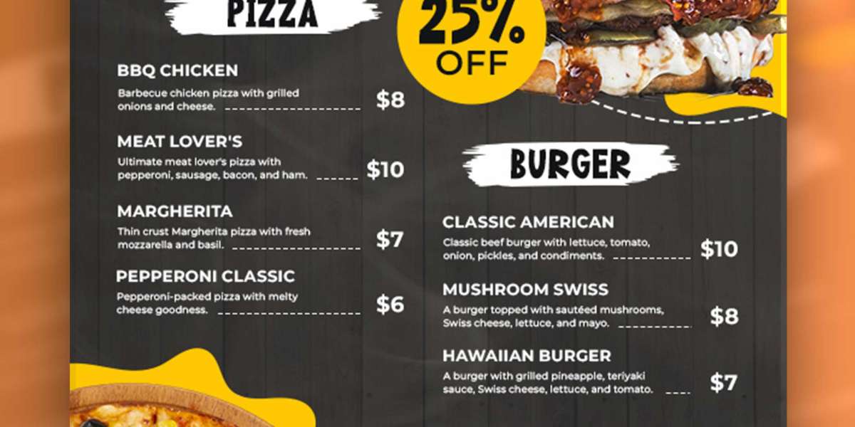
One of the most powerful yet subtle elements of visual design is color. Understanding and applying color theory in restaurant menu design can influence customer choices, shape perceptions of value, and even increase sales. This article explores the psychological principles behind color theory and how they apply to the strategic construction of menus that entice and guide diners effectively.
Understanding Color Theory: The Basics
Color theory is a conceptual framework used by designers and artists to understand how colors interact and affect human perception. It categorizes colors into primary, secondary, and tertiary hues and explains their relationships using tools like the color wheel.
The three main components of color theory are:
Hue: The name of the color (e.g., red, blue, green).
Saturation: The intensity or purity of a color.
Value: The lightness or darkness of a color.
Colors can be complementary (opposite on the color wheel), analogous (next to each other), or part of a triadic or split-complementary scheme. These relationships can create harmony or contrast, depending on how they are used.
In menu design, this theory becomes a psychological tool. The right color combinations can evoke emotions, stimulate appetite, and guide the eye through a curated experience. Each color has distinct associations that can be leveraged for specific goals.
The Psychology of Color in Menu Design
Color affects mood and behavior. In marketing and branding, businesses rely on these effects to influence consumer decision-making—and menus are no exception. Here’s a breakdown of how certain colors affect diners:
Red: Appetite and Urgency
Red is one of the most widely used colors in food advertising and dining environments. It is believed to stimulate appetite by increasing heart rate and creating a sense of urgency. Fast food restaurants often employ red to encourage quick decisions and high turnover.
In menu design, red can highlight daily specials, limited-time offers, or high-margin items. However, too much red can become overwhelming, so it is best used for emphasis rather than as a dominant background.
Yellow: Happiness and Attention
Yellow is an energetic and attention-grabbing color. It conveys cheerfulness and warmth, and like red, it is also thought to enhance appetite. In menus, yellow is effective when used sparingly to draw attention to specific items or headings.
When paired with red, yellow creates a dynamic and effective combination. This duo is common in restaurant menu design because it is both eye-catching and appetite-stimulating.
Orange: Warmth and Enthusiasm
Orange blends the appetite-stimulating qualities of red with the cheerful energy of yellow. It is seen as friendly and inviting and is often associated with affordability and casual dining. Orange works well in family-friendly or informal restaurant menus.
However, like red and yellow, orange should be used thoughtfully. Too much can appear garish, but as an accent, it adds vibrancy.
Green: Health and Freshness
Green is commonly linked to health, freshness, and sustainability. For restaurants that focus on organic, vegetarian, or eco-friendly offerings, green is a natural choice. It evokes a sense of calm and balance, and can make diners feel good about their food choices.
In upscale establishments, a subdued green palette can also signal sophistication and nature-inspired luxury.
Blue: Calm and Trust
Blue is a curious color in the context of food—it is the least appetite-stimulating hue. There are few naturally blue foods, and historically, blue has been used to suppress appetite in weight-loss strategies.
Despite this, blue is associated with trust, calmness, and cleanliness. In certain dining environments—such as seafood restaurants or fine dining establishments—it can suggest freshness or a refined, serene experience.
Purple: Luxury and Creativity
Purple is often associated with luxury, mystery, and creativity. It can be a bold choice in menu design, particularly for establishments with a unique or high-end brand identity. While not common in traditional menus, purple can be used effectively in dessert sections or drink menus to suggest indulgence.
Black and White: Sophistication and Clarity
Black implies elegance, formality, and power, while white symbolizes simplicity, purity, and cleanliness. Together, they create contrast and make content stand out. High-end restaurants often use minimalist black-and-white menu designs to convey refinement and clarity.
When paired with gold or silver, black elevates the perception of exclusivity, making it ideal for premium pricing strategies.
Brown and Earth Tones: Wholesomeness and Comfort
Brown, beige, and tan evoke earthiness, comfort, and tradition. These tones are common in cafes and bakeries, where they suggest a connection to home-style cooking or artisanal quality. They pair well with green in menus that emphasize natural or locally sourced ingredients.
Color Placement and Hierarchy in Menu Design
Beyond selecting colors, how and where color is used on a menu is equally important. Effective color placement can:
Guide the eye to high-margin items.
Create a logical flow through sections.
Improve readability and scannability.
Here are a few techniques to consider:
Highlight Boxes and Color Blocks
Using colored boxes or backgrounds behind specific items can help them stand out. For example, placing the chef’s special in a gold or red box draws attention. This is especially effective when you want to steer customers toward more profitable dishes.
Section Headings
Colors used for category headers (e.g., Appetizers, Entrees, Desserts) help create structure. Consistent use of one color for headings ensures clarity, while slight variations can differentiate subcategories.
Price Anchoring and Value Perception
The way color interacts with price affects how diners perceive value. Using a color that blends with the background for prices can de-emphasize cost. In contrast, emphasizing premium items with a bold color can suggest exclusivity and justify higher prices.
For example, if your menu background is ivory, using gray for most prices and gold for premium items subtly encourages upselling.
Seasonal and Thematic Colors
Changing menu colors to match seasons or holidays creates visual novelty and thematic consistency. A fall menu might use warm tones like burnt orange and mustard yellow, while a summer menu might lean into oceanic blues and bright greens.
These changes keep the brand feeling fresh and current while engaging returning customers.
The Role of Color in Digital Menus
With the rise of digital and QR code menus, the rules of color design have evolved. On screens, contrast and readability are crucial. High-saturation colors can appear too bright, and subtle hues might get washed out depending on the device.
Digital menus should use:
High contrast between text and background.
Limited use of highly saturated colors.
Accessible color combinations for colorblind customers (e.g., avoiding red/green combinations).
Interactivity also allows for hover effects, animation, and visual feedback that can highlight color shifts when users select items—adding a new dimension to how color influences behavior.
Cultural Considerations in Color Use
Color meanings can vary significantly across cultures. While red might symbolize appetite in the West, it can represent good fortune in China or mourning in South Africa. When designing menus for multicultural or international audiences, it's essential to research and consider these associations.
For example:
White is associated with purity in Western cultures but can symbolize death in some Asian countries.
Yellow may symbolize wealth and royalty in some cultures but cowardice in others.
A thoughtful, localized approach to restaurant menu design ensures that your use of color resonates positively with your target audience.
Branding and Menu Color Consistency
Color is a foundational element of brand identity. The menu should be a seamless extension of the restaurant’s visual brand. If your restaurant’s logo and interiors lean heavily on teal and copper, your menu should echo these hues.
This consistency builds trust and brand recognition. A jarring disconnect between your menu and your physical or digital space can create subconscious confusion or distrust among customers.
Testing and Iteration
As with any design, effective use of color should be tested. Businesses can A/B test different menu colors or layouts to see which combinations lead to higher average check sizes or faster ordering times.
Surveys, focus groups, or simply observing customer behavior (such as which menu items sell most) can provide valuable feedback. Continual iteration and refinement are key to mastering color’s role in menu design.
Case Studies: Successful Use of Color in Menus
Fast Food Chains
Major fast-food brands like McDonald’s and Burger King consistently use red and yellow. These colors evoke urgency and appetite, pushing customers to make quick decisions and reinforcing brand familiarity.
Their menus use high-contrast, bold fonts, and clear category divisions—often with red used to spotlight combo deals or limited-time offers.
Health-Focused Cafes
Juice bars and vegan cafes often use green, white, and light wood tones in their menus. These colors suggest cleanliness, health, and transparency. Menu items like “Detox Smoothie” or “Superfood Bowl” are highlighted in vibrant green or yellow to emphasize freshness and energy.
Upscale Restaurants
High-end restaurants often embrace minimalist color palettes—black, white, gold, and charcoal. The minimal use of color enhances the perception of sophistication and elegance. In these cases, color is used sparingly and intentionally, often to highlight the name of the chef or a signature dish.
Conclusion
Color is not merely a decorative element in menu design—it is a powerful psychological and strategic tool. When used with intention, color can influence appetite, guide customer choices, enhance branding, and ultimately increase sales.
Whether you’re designing a printed tri-fold menu or a sleek digital interface, understanding the principles of color theory gives you a competitive edge in curating the diner’s journey. From bold reds that spark hunger to serene blues that soothe the soul, every hue holds potential.


