When it comes to real estate, having a strong brand identity is crucial for success. One of the key elements of branding is a well-designed logo that represents your business and resonates with your target audience. In this article, we will explore the dos and don'ts of logo design specifically tailored for the real estate industry. By following these guidelines, you can create a compelling and memorable logo that enhances your brand image and helps you stand out from the competition. If you're looking for inspiration, check out our collection of real estate logo ideas, showcasing various creative concepts and designs to spark your imagination.
Logo Design Dos for Real Estate
Do Understand Your Target Audience
Before diving into the logo design process, it's essential to have a clear understanding of your target audience. Real estate caters to a diverse range of clients, including homebuyers, sellers, investors, and renters. Consider the demographics, preferences, and aspirations of your target audience to create a logo that resonates with them. Research their interests, lifestyles, and design preferences to ensure your logo speaks directly to their needs and desires.
Do Research Competitors
In a competitive industry like real estate, it's crucial to differentiate yourself from other players in the market. Conduct a thorough analysis of your competitors' logos to identify design trends, color schemes, and visual elements commonly used in the industry. While you should aim for a unique logo, understanding what works and what doesn't in the real estate market will help you make informed design choices and avoid clichés.
Do Keep It Simple
Simplicity is key when it comes to logo design. A cluttered or overly complex logo can be confusing and fail to make a lasting impression. Opt for clean lines, minimalistic icons, and clear typography to ensure your logo remains visually appealing and easily recognizable across different platforms and scales. Remember, simplicity also improves versatility, making your logo adaptable for various marketing materials and mediums.
Do Choose Appropriate Colors
Color psychology plays a significant role in branding, evoking emotions and conveying messages. For real estate logos, it's important to choose colors that align with the industry's values and evoke trust, professionalism, and stability. Blue, for example, is often associated with trust and reliability, while green can represent growth and harmony. Experiment with color combinations that resonate with your target audience and reflect your brand's identity.
Do Prioritize Legibility
A logo is ineffective if it cannot be easily read and understood. Legibility should be a top priority when designing a logo for your real estate business. Select clear and easily readable fonts that maintain readability even at smaller sizes. Consider how your logo will appear on different marketing materials, including websites, business cards, signage, and billboards. Test the legibility of your logo by scaling it down to ensure it remains visually appealing and understandable.
Do Create a Timeless Design
While it's tempting to follow design trends, a logo that stands the test of time is essential for building brand recognition and consistency. Avoid incorporating trendy elements that may quickly become outdated. Aim for a logo design that remains relevant for years to come, ensuring your brand maintains a professional and credible image. Classic design elements, such as clean typography and balanced compositions, are timeless choices that will keep your logo relevant.
Logo Design Don'ts for Real Estate
Don't Use Generic Symbols
In the real estate industry, it's common to see logos with generic symbols like houses, roofs, and keys. While these symbols can be relevant, they are overused and lack originality. Strive for a logo that represents your brand uniquely and creatively.
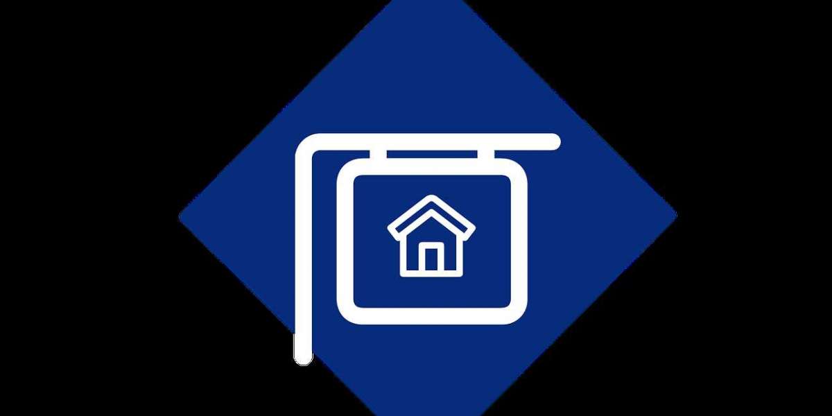
Logo Design Don'ts for Real Estate
Don't Use Generic Symbols
In the real estate industry, it's common to see logos with generic symbols like houses, roofs, and keys. While these symbols can be relevant, they are overused and lack originality. Strive for a logo that represents your brand uniquely and creatively. Explore alternative symbols or visual metaphors that communicate your brand's values and offerings in a more distinctive way. Stand out from the crowd by thinking outside the box and avoiding clichéd design choices.
Don't Rely Solely on Trends
Design trends come and go, and relying solely on them can lead to a logo that quickly becomes outdated. It's essential to strike a balance between current design aesthetics and timeless appeal. Avoid following fleeting trends that might not resonate with your target audience in the long run. Instead, focus on creating a logo that embodies the essence of your real estate business and remains relevant for years to come.
Don't Neglect Scalability
Your logo will be used across various platforms and sizes, so scalability is crucial. A logo that looks great on a website header might lose its impact when reduced for a business card or signage. Ensure your logo is designed in a vector format, allowing it to be scaled up or down without compromising its quality and legibility. Test your logo in different sizes to ensure it remains visually appealing and recognizable across all mediums.
Don't Overcomplicate the Design
While creativity is important, overcomplicating your logo design can lead to visual clutter and confusion. Avoid incorporating too many elements, intricate patterns, or excessive details that may overwhelm the viewer. Remember, simplicity is key to creating a memorable logo. Strive for a design that is clean, balanced, and easily comprehensible. The ability to convey your message in a clear and concise manner will leave a lasting impression on your audience.
Don't Neglect Typography
Typography plays a significant role in logo design. The right font choice can enhance the overall message and personality of your brand. Avoid using generic or overly decorative fonts that may hinder legibility. Instead, opt for a font that is clean, modern, and aligns with your brand's image. Pay attention to spacing, kerning, and readability, ensuring that your logo's typography is well-crafted and visually appealing.
Don't Underestimate Professional Help
Designing a logo that embodies your brand's essence and effectively communicates your message can be a challenging task. If you lack design expertise, don't hesitate to seek professional help. Graphic designers experienced in real estate branding can provide valuable insights and create a logo that captures the unique identity of your business. Investing in professional logo design ensures a high-quality result that resonates with your audience and sets you apart from competitors.
FAQs (Frequently Asked Questions)
Q: What makes a logo design effective for a real estate business?
A: An effective logo for a real estate business should be simple, memorable, and relevant to the target audience. It should convey the brand's values, evoke trust and professionalism, and be adaptable to various marketing materials.
Q: Can I use colors other than blue and green for a real estate logo?
A: Absolutely! While blue and green are commonly associated with trust and growth, respectively, you have the freedom to explore other colors. Consider your brand's personality and the emotions you want to evoke when selecting colors for your logo.
Q: Is it necessary to hire a professional graphic designer for logo creation?
A: While it's not mandatory, hiring a professional graphic designer can significantly enhance the quality and effectiveness of your logo. They have the expertise and experience to create a unique and impactful design that aligns with your brand's vision.